Simple Habit
Simple Habit | Mobile App Redesign
About Simple Habit
Simple Habit is a mindfulness app that offers users a library of guided meditations for various goals and occasions—from achieving better sleep to re-focusing during a rough work week. Simple Habit is the first app in the meditation space to use a model similar to Spotify and Netflix—curating content from teachers all over the world.
The Challenge
Simple Habit encourages users to form a daily habit—to incorporate mindfulness practices and meditation throughout their everyday lives. However, they find that many users aren't completing a meditation within the first 7 days of signing up.
They challenged us to uncover what was causing this friction preventing users from completing a meditation, and tasked us to redesign their existing app to help them solve this problem.
Role
- Heavily involved from end to end
- Conducted user interviews, usability test and diary studies
- Researched apps for content personalization—competitive and comparative analysis
- Created style guide/design inventory
- Created screens and prototypes for both LoFi and HiFi
The Process
The project lasted 8 weeks and followed this 5-step framework:
Research
User Interviews
To get a better understanding about the role meditation plays in people's lives, we conducted user interviews with 7 people who have an interest in meditation or who have meditated in some capacity in the past—either with an app or by other means.
Overall, we wanted to gain more insight into the following:
- The deeper, underlying motivation as to why they began/still meditate and the role that meditation plays in their lives
- The situations and contexts they find themselves turning to meditation
- Other apps, products, or activities they use to fill a similar role (for comparative research)
- Features and content they would expect from a meditation app
Usability Tests
We also had the same 7 users complete the following tasks within the app to see what pain points we could uncover:
- Complete sign up and onboarding
- Explore the app and give us your general impressions
Imagine the scenario we uncovered from the above interview. Find a meditation you would use during that specific situation.
Diary Studies
Retention over the first 7 days was a very important metric the company mentioned in the initial consult. To get a better idea of pain points users encountered when using the app on a daily basis, we conducted diary studies with 5 new individuals and asked them to meditate using Simple Habit for a week straight—having them answer a short questionnaire after each session.
Competitive / Comparative Research
We looked at others apps in the space to see what they were doing well and what they were doing poorly.
Because Simple Habit was offering content in a much different way the the others in the space--we decided to do some comparative analysis as well, to get a sense of how other apps were organizing content and tackling discovery for their users.
From our research we uncovered a lot of high level findings about content organization and user motivations. In the next section, I'll discuss how we organized and focused these findings.
Synthesize & Focus
Define
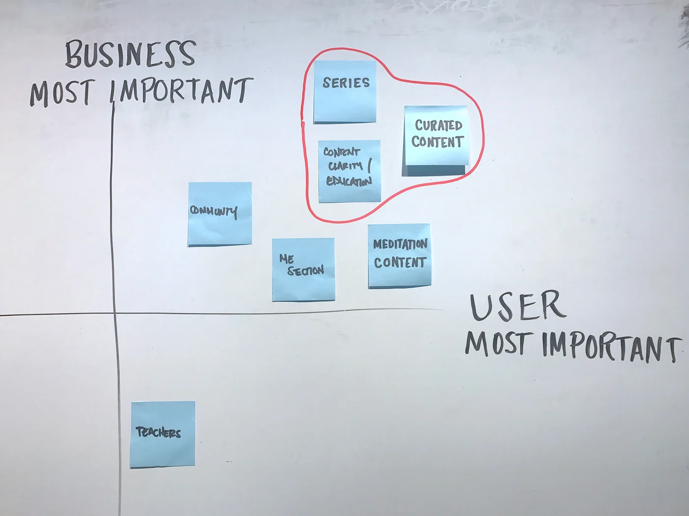
We used an affinity map to compile and organize all of our insights from interviews, usability tests, and diary studies. We then used a 2x2 analysis to define the most important pain points we wanted to focus on.
Retention was the high level goal for the project—especially for new users. However, from our research, we found that content overload was the main problem that needed to be solved. Users weren't finishing meditations in the first week because they were having trouble finding meditations.
““...too much choice causes the feeling of less happiness, less satisfaction and can even lead to paralysis.””
Here are the main pain points we uncovered:
- Content overload/Paradox of Choice - Users were finding it difficult to choose the right meditation for them due to the amount of options available and how the content was being presented to them
- Content Clarity - Many users were also unable to understand what certain sections or specific meditations meant—and more specifically what they would get out of that meditation
- Roadmap - Most of the users we tested, as well as Simple Habit's target users, are new to meditation. For these users, having content recommended specifically for them, and a clear path where to begin and follow, is very important for them.
Personas & Jobs To Be Done
Before heading into LoFi, we created a persona—based on data given to us by Simple Habit—about their target users. We then used Job Stories—a modified version of User Stories, that uses the Jobs-to-be-Done framework—to get a deeper understanding behind users' motivations to meditate. We used these frameworks to inform us through the rest of the design process and help keep our users in mind when we were making design decisions.
Ideate
Focus
Now that we had synthesized our research and narrowed down the pain points we needed to solve, it was time to decide what aspects of the app to focus on for our redesign. To address content overload and understanding we chose to focus on:
- Onboarding - Focusing on educating the user about meditation and the content within the app, as well as curating content specific to the user
- A Personalized Home Screen - Tailored to the user based on onboarding, and their use of the app over time
- Dedicated Browse Section - Splitting it away from the home screen to alleviate content overload
Design Studio
Once we narrowed down our focus, we conducted two design studios to bring all of our ideas to the surface. We diverged and sketched out ideas separately, voted on our favorites, discussed the various designs, and then converged our favorite ideas together. We did multiple rounds, over two sessions to hash out all of the screens we wanted to create or redesign.
Low-Fidelity
Based on the results of our design studio, we created LoFi mockups of our redesign as well as a clickable prototype. We then tested it among 5 users that fit Simple Habit's target user for comprehension.
We went through two versions of the LoFi prototype and two rounds of testing making changes in between based on the results and user feedback.
Design changes:
Onboarding Flow
Welcome screen to give new users insight into what the app has to offer
Establishes users experience level to offer users a starting point and roadmap
Topics of focus to curate and recommend on the new personalized home screen
Organization of Content
- Created a new personalized home screen—prominent starting point with additional content recommended based on user goals and previous meditations
- Separated the browse page and included topic descriptions
- Visually differentiated single meditations and series
- Included series descriptions to give users more context before beginning their 7-day journey
High-Fidelity
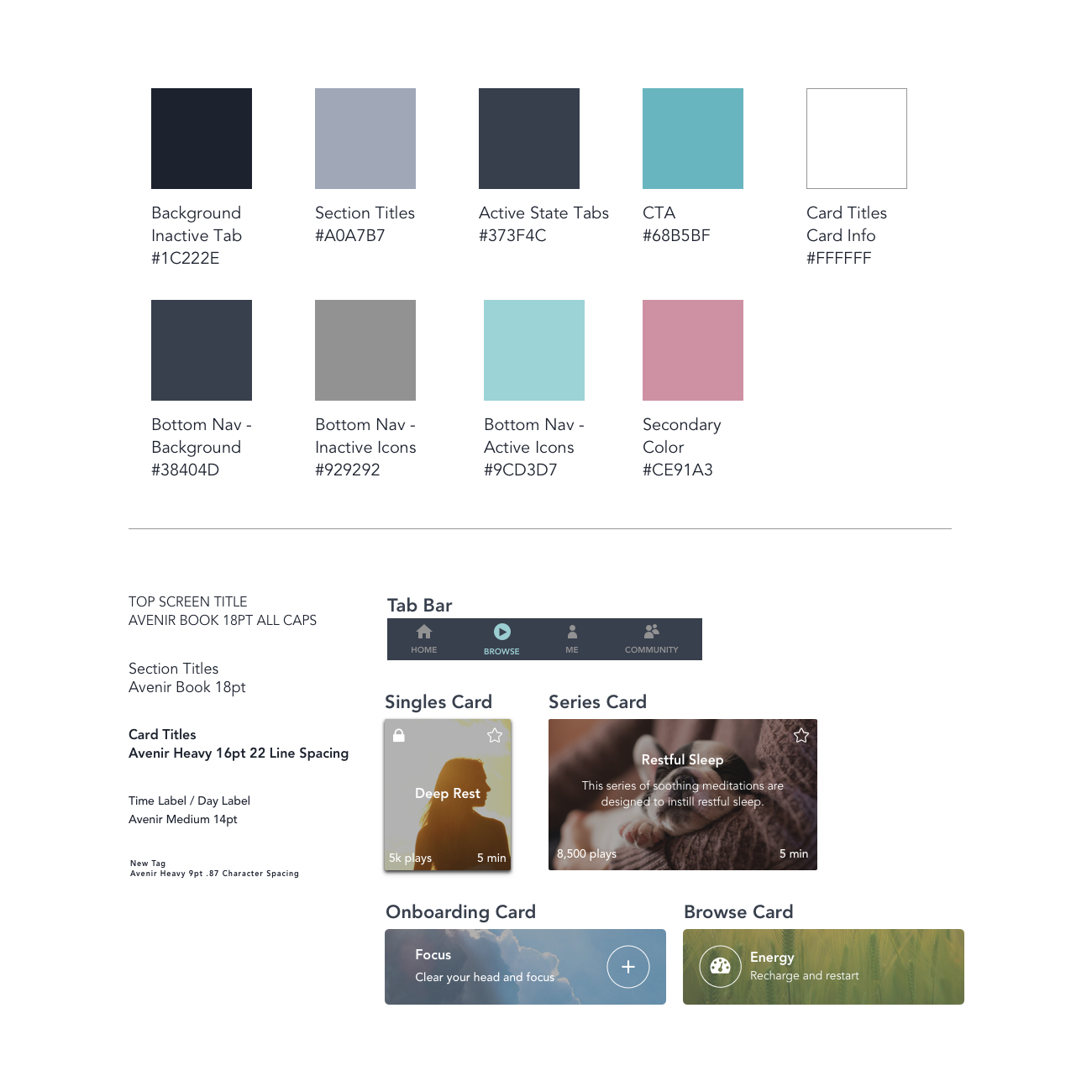
Style Guide
Before translating our LoFi designs into HiFi screens, I reviewed the current app and created a style guide that the team could follow to keep consistency throughout HiFi.
HiFi Screens
Using the above style guide, we translated our LoFi screens into HiFi.
HiFi Prototype
We created a HiFi prototype and tested our designs with 5 people that represented Simple Habit's target users.
Conclusion
Simple Habit challenged us to figure out why more users weren't completing more meditations within the first 7 days of installing the app. We discovered that a lot of this friction came before a meditation was even chosen—users were overloaded with content and were having difficulties finding the right meditation to begin, let alone finish.
We learned a lot about personalization, and the organization and presentation of content, but there are 2 key takeaways:
- It's crucial, early on, to educate users on the benefits of using your product—help them understand what it is they'll gain or take away from using it.
- It's equally as important, to reduce the amount of friction and cognitive load that it takes to begin using your product—allowing them to experience these benefits, first hand, right away.
Reducing the friction it takes for users to get to that "Aha!" moment with your product, and allowing them to experience the benefits of using it, right away, will get users to return—not just in Simple Habit, but in any product.


