StubHub
A UX Case Study
StubHub | A UX Case Study
There's always that sold out show that we just have to attend, but at what cost? StubHub has been the go to for many, including myself, for finding great deals on concerts, shows, and sporting events.
Though countless concert goers and sports fanatics use the app to see their favorite artist or cheer on their favorite sports teams, there's definitely room for improvement. I wanted to discover what pain points users were encountering, and see what ways I could improve the user experience.
The Process
The framework I used for this challenge consisted of 5 steps:
Empathize
Guerrilla Usability Testing
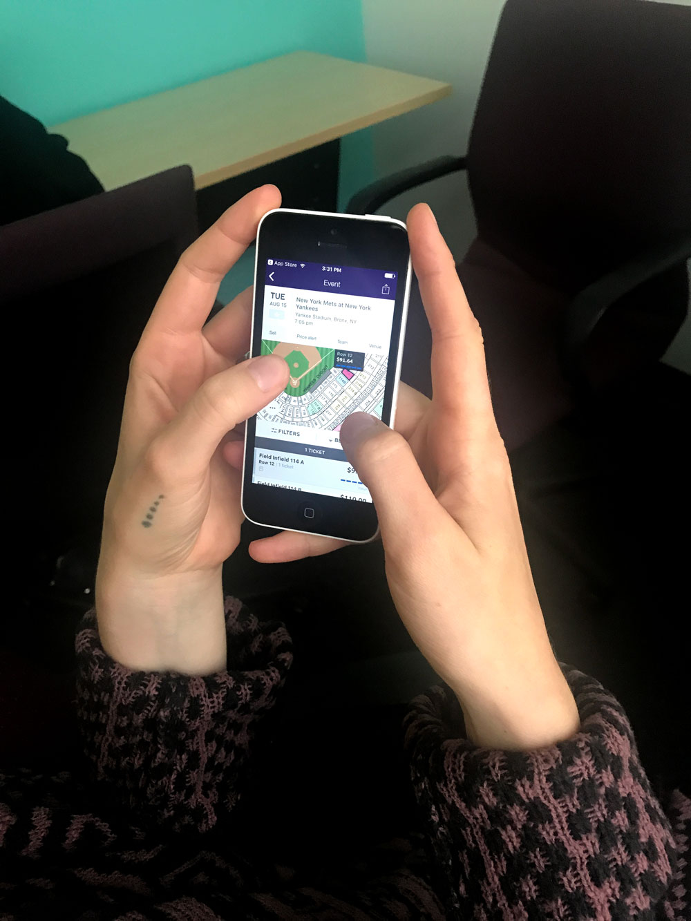
To gain a little insight into where users struggle using the app, I went to Yerba Buena Gardens and conducted guerrilla usability testing. Guerrilla usability testing is cheap, quick, and can reveal important insights with just 5 users.
I gave each person three tasks to complete within the StubHub app:
- Find cheap Hamilton tickets for a friend visiting in July
- Explore some events you might be interested in attending on your trip out of town this weekend
- Find the cheapest tickets to the NBA Finals
Organize and Define
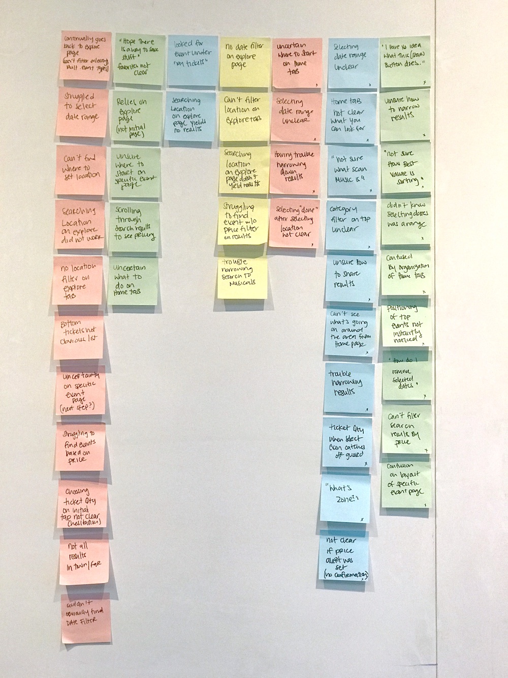
I took down observations and things people said during their interviews. Each colored post-it/column represents a different user.
Then I grouped my findings based on similarities. This helped me define specific user pain points.
Now that pain points were defined, I needed to figure out which problems would be most important to fix. I created a 2x2 matrix to help me prioritize the most pressing issues based on what would be most important to the user and to StubHub as a business.
I decided to focus mainly on the event page. This is where the goals of the users and the business align--finding tickets quickly and easily. Most users got hung up after they had chosen their desired event. Viewing and organizing the list of different tickets seemed to be a problem for almost all of the users I tested.
Understanding the User
It's important to understand your users, and their motivations. To dive a little deeper, I used USMO (Users, Situations, Motivations, and Outcomes) and Job stories.
From there, I created these two provisional personas to help guide the design process. These personas would be updated as we dive deeper and get a better understanding of the users.
Ideate
Task Flow
I analyzed the existing task flow for finding tickets to an event to better understand where in the process users are having trouble. I highlighted in red the area where most users struggled, and the area that I want to focus most of the redesign.
Existing UI
These are the two main screens that I want to direct my focus for the redesign:
Lo-Fi Sketches
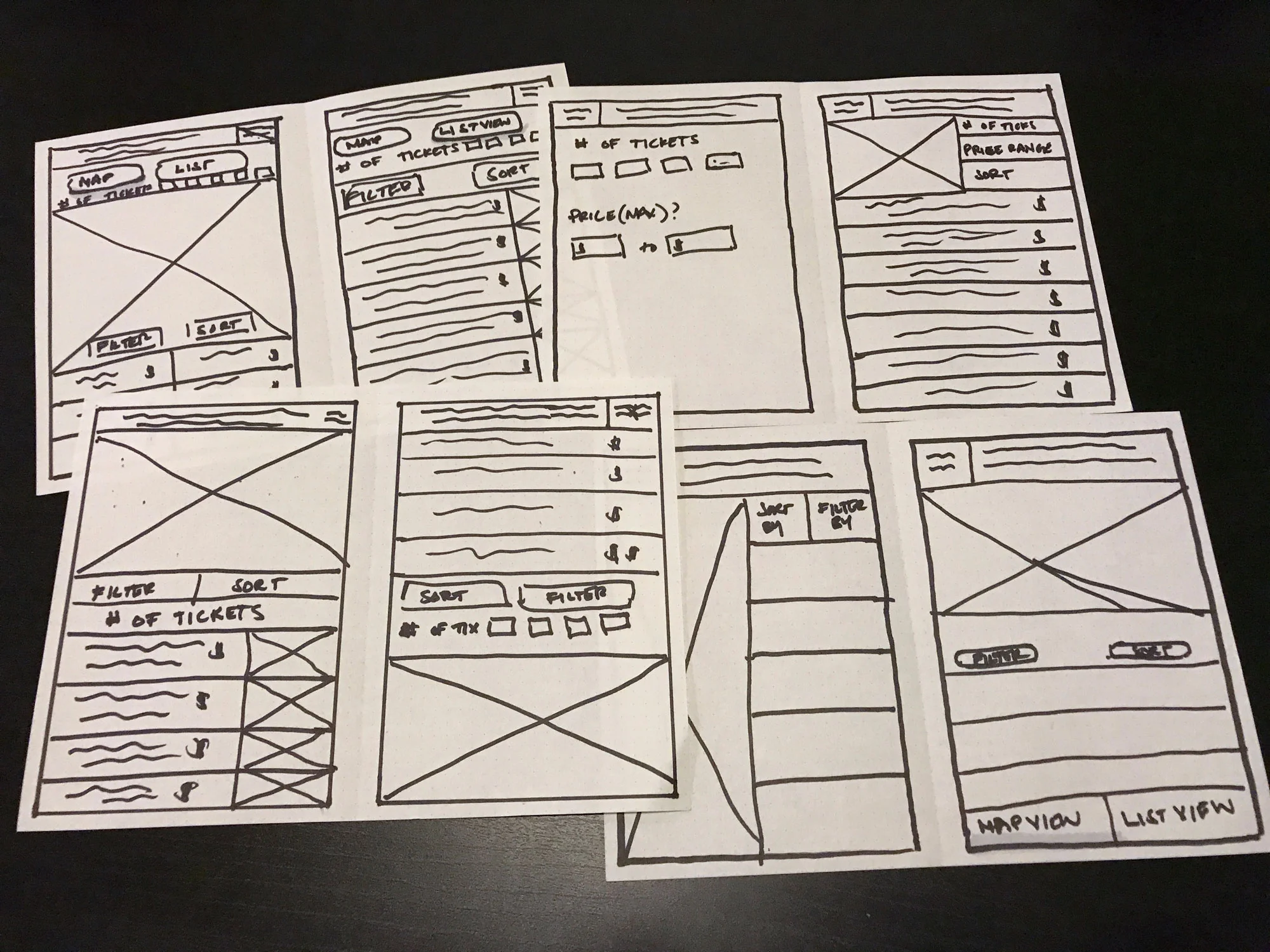
Now that I had gotten a good sense of the pain points I wanted to solve, I began sketching out some possible solutions.
Prototype and Validation
From my Lo-Fi sketches, took the best ideas and created Hi-Fi mockups. Below is my redesign for the home and event screens compared to the original.
Clickable Prototype & Testing
Once the High Fidelity screens were completed, I created a clickable prototype to test if my changes improved the usability and decreased confusion and information overload users experienced when trying to find tickets.
I used the first task from my initial testing so that I could compare results without introducing additional variables that could impact the results.
Task: You have a friend visiting the second week of July, and she wants to see Hamilton, but doesn't want to spend a lot of money.
Results
Key Takeaways
- Users expect commonly used functions to be easy to locate and understand. Making them search and hunt for these key features causes unwanted frustration in completing core tasks.
- Users look to our products to make their lives easier. Offering too much information and too many options up front causes information overload and unnecessary friction for users to reach their end goal.
- Understanding what is important to your users--what to emphasize and de-emphasize--will create a seamless and more pleasant experience.
Disclaimer: I do not work for, nor am I affiliated with, StubHub. This was an unsolicited exploration of design and was used as a tool for learning.


